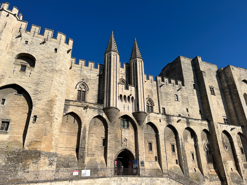
I have recently been playing around with black and white photography. Although I would never claim to be a serious photographer, I enjoy taking pictures, and I love images that look good (to me, at least). The decision to switch my EP-5 to black and white (there’s an ‘art’ setting) has made me think about why, as a wannabe photographer, I’d want to restrict myself in this way. After all, we see in colour. Monochromatic images are artificial. So what is the point of not using colour, when it is available?
Initially, of course, all photographs were monochromatic. When movies came along, they were monochromatic too. It was because there was no alternative. When colour photography and cinematography emerged, it must have been quite magical. Imagine seeing a colour photograph for the first time! Or a film in colour (introduced in the late 1920s, but in 1947, apparently, still only 12% of US films were shot in colour). The thrill from watching a colour film for the first time is hard for those of us who have grown up with colour television to appreciate.
For a while, the cost of colour film (and the more complicated and expensive processing it requires) would have kept it inaccessible for many, and so black and white film remained long after the technology existed to produce colour. But once this hurdle was overcome, why would anyone go back and restrict themselves to monochromaticity?
It is because there’s something about a good black and white image that is very powerful. For an artist, the choice to place limits on the available creative space can often unlock greater creativity. Think of a play with just two cast members and one set. It could be boring, but these limitations could actually make it truly great. I love music, and in the past I have been in recording studios. The temptation to add an extra track, or layer the sound more, or fill in more of the sound space is immense, especially if you are recording digitally (in the band I was in at university, we were saved from ruining our recordings by only having eight [analogue] tracks to play with). But it is the space that needs to be preserved: often, restricting yourself to fewer tracks can result in a more profound work. An artist’s palette restricted to fewer colours can result in a more interesting painting.
While the lack of access to colour because it is expensive or unavailable was no doubt frustrating, this same restriction can end up being liberating and creative where it is the result of choice. When there is an option for colour, readily available, the shackles of monochrome can prove to be creatively liberating.
Does this also apply to wine? If a winegrower sheds the tools of the modern winery, can they end up making a more profound, creative rendition of their terroir? By limiting their options, can they liberate themselves to work better, just as an artist restricting their palette might make a more interesting painting?
To a winemaker 150 years ago, few tools were available. From today’s perspective, the lack of refrigeration technology, filtration, effective fining agents, cultured yeasts, nutrients and enzymes seems rather limiting. But now these tools are available, the choice not to use them is actually a creative decision. In the vineyard, organics is now a choice: before modern agrochemicals, it was the way everyone had to work. Psychologically, it’s very different to not have the option to do something, rather than to have the option and then not to choose it.
Exploring a limited creative space can be incredibly powerful, in art and also in wine.
6 Comments on Exploring a limited creative space: black and white and wine


The problem with digital B&W, especially when reduced for the interweb, is the increase in contrast and resultant loss of detail. For a documentary blog, such as yours, this is counterproductive. The image at top of this post is an example. On my monitor the figure in the background is almost invisible and the barrels are indeterminate circles. Maybe i need a better monitor or perhaps Jamie needs an ART blog?
Hi Jamie, the comment of fatFred is spot-on as far as I’m concerned!If you had a blog on photography maybe I would agree with you, but your blog is supposed to be for winelovers, interested in wine, winemakers and the places where the wine is made. Supporting this information by pictures is very useful and for me – and I sure I’m not alone in that – colour is an important factor in these pictures. Agreed, it’s your blog, I don’t pay you. so I don’t have any right to complain, but please: return to good “old-fashioned” colourpictures!
If this was in colour it would be another boring shot of a winemaker and a wall of barrels.This shot can be seen on almost any page on wine. Now that it is in black and white one has to work a bit. Is it an overhead shot of wine bottles? No, there is a figure lending some perspective and context to the shot.
As a winemaker, it was most gratifying to read that by shedding the tools of modern technology in my winery and refusing to use agro-chemicals in my vineyards, I can end up making a more profound, creative rendition of my terroir; being a bit of a cynical old bastard, as they say, I’d never thought of it that way before.
I appreciate the point you are making in your article,rather than the actual illustration 🙂
and I am old enough to recall black and white films
‘If this was in colour it would be another boring shot of a winemaker and a wall of barrels’
Which kinda proves the point because on closer examination – via daughters spiffing new laptop – the ‘winemaker’ proves to be another photographer!
Or perhaps it is Jamie himself, in a mirror, with a load of barrels behind him.
Or…….
it’s ART!