
![]()
![]()
![]()
![]()
![]()
![]()
![]()
![]()
![]()
![]()
![]()
![]()
| What is the J-shaped curve? |
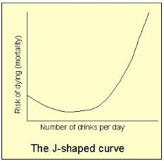 Take a
piece of graph paper. Now take a large population of people for whom you know their
average daily alcohol consumption, and their mortality (when they die). Plot the mortality
on the upright axis, and on the horizontal axis plot alcohol average daily consumption.
Now fit a curve to the data points. If you have a large enough population, you'll see a
nice curve that has the shape of a J (see figure, right). That is, those
who drink nothing have what is taken to be baseline mortality -- the risk of death we use
as a reference point. As daily consumption increases, what we find is that risk of death
drops slightly. Then, as alcohol consumption increases, the risk of death increases until
it reaches the baseline (these people have the same risk of death as those who drink
nothing at all), and as drinking gets heavier, the risk of death continues to increase
steadily. This is called the J-shaped curve, and is a remarkably consistent finding from
many large studies. It is the solid body of data that has led to the conclusion that
moderate drinking is indeed beneficial to health, although this throws up a whole set of
new questions which are explored further in other articles here.
Take a
piece of graph paper. Now take a large population of people for whom you know their
average daily alcohol consumption, and their mortality (when they die). Plot the mortality
on the upright axis, and on the horizontal axis plot alcohol average daily consumption.
Now fit a curve to the data points. If you have a large enough population, you'll see a
nice curve that has the shape of a J (see figure, right). That is, those
who drink nothing have what is taken to be baseline mortality -- the risk of death we use
as a reference point. As daily consumption increases, what we find is that risk of death
drops slightly. Then, as alcohol consumption increases, the risk of death increases until
it reaches the baseline (these people have the same risk of death as those who drink
nothing at all), and as drinking gets heavier, the risk of death continues to increase
steadily. This is called the J-shaped curve, and is a remarkably consistent finding from
many large studies. It is the solid body of data that has led to the conclusion that
moderate drinking is indeed beneficial to health, although this throws up a whole set of
new questions which are explored further in other articles here.
Other articles
- Introduction
- Wine, coronary heart disease and mortality
- Wine and health, other than coronary heart disease
- Study design: why it so difficult to 'prove' any of the theories about the beneficial effects of wine or other alcoholic drinks
- What is the French paradox?
- How it works: possible mechanisms underlying the beneficial effects of alcohol